Multicolumn

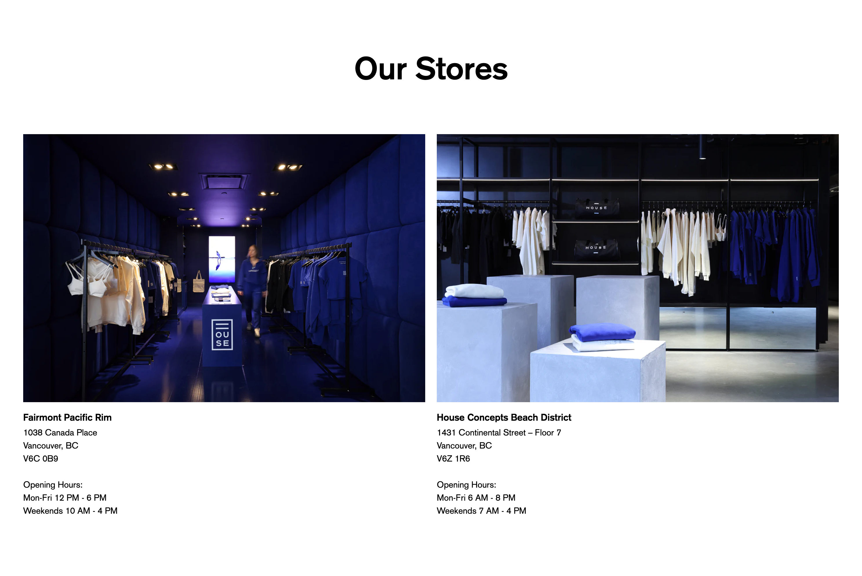
The Multicolumn section is designed to show related content in a typical grid column layout. Within the theme editor you can specify various options to create a balanced and elegant column layout.
Each column block can include any combination of the following elements:
- Video
- Image
- Heading
- Text
- Link or button
- Pop-up modal or drawer content
Each column can include a link to a page, or can display page content in a self-contained modal or drawer.
Media ratio
Applies if you include images or videos in your content. It can be set to:
- Square
- Portrait 4:5
- Portrait 4:6
- Landscape
- Adapt to image (the ratio will be dictated by your chosen image or video)
Number of columns on desktop
This can be set to a 2, 3 or 4 column layout. Choose the layout that suits your content. On mobile, the layout is automatically optimized in a single column.
Layout
You can choose between a horizontal carousel style layout or a stacked grid. You can also specify different layouts for mobile and desktop - for example a carousel on mobile and a stacked grid on desktop.
Column spacing
You can set the space between each column, ranging from 0-100 pixels. Choose less spacing for a tight look & feel, or more spacing for a more spacious look & feel.
Keylines
You can choose whether to show keylines or not. If activated, vertical keylines are displayed between each column which adds a certain aesthetic to the design.
Borders
You can set an optional top or bottom border to the section.
