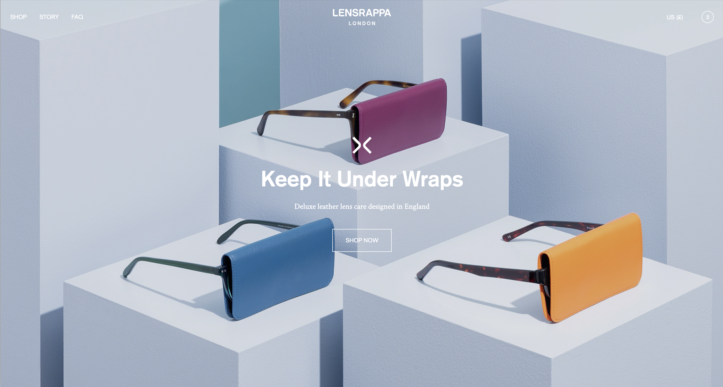
Image banner

The Image banner is one of the most widely used sections on any online store.
Blocks
In addition to the background image/s, the Image banner can contain the following blocks:
- Logo
- Caption
- Heading
- Text
- Buttons
Each block has relevant options for layout, text alignment and font size. Each block is optional – you can show or hide any block. The buttons block can contain up to 2 buttons and includes options for showing or hiding each button.
Settings and options
| Banner height | Set the height of the banner. Choose from ‘Full screen’ , Large, Medium or Slim. If set to ‘Full screen’, the banner will automatically re-size to the height of the screen/device. |
| Main image/Secondary image | You can choose 1 or 2 images for the banner. If two images are added, you can create a number of layout options. Get creative – experiment with different layouts and blur effects. Image padding: Creates white space around the image. Animation effects: You can choose from 6 animation effects. Blur: You can blur the image on a scale from 0-100%. Show on mobile: You can turn on/off each image on mobile. |
| Text | You can choose from 7 positions for the text position. You can also choose the text alignment, text width and padding. You can also choose whether the text fades in on load. Tip: If you set the text position to left or right, you’ll only see an effect if you also set the text width to 75% or 50%. |
| Top/bottom padding | Sets vertical padding on the text. Useful if you want to offset text away from the top or bottom of the banner. |
| Color scheme | The foreground color is limited to a choice of white or any of your theme text color options. The background color can be set using a color picker to choose any color, allowing you to match the banner background to your chosen image/s. The image overlay opacity setting is useful for improving contrast of text against the background image. |
