Products
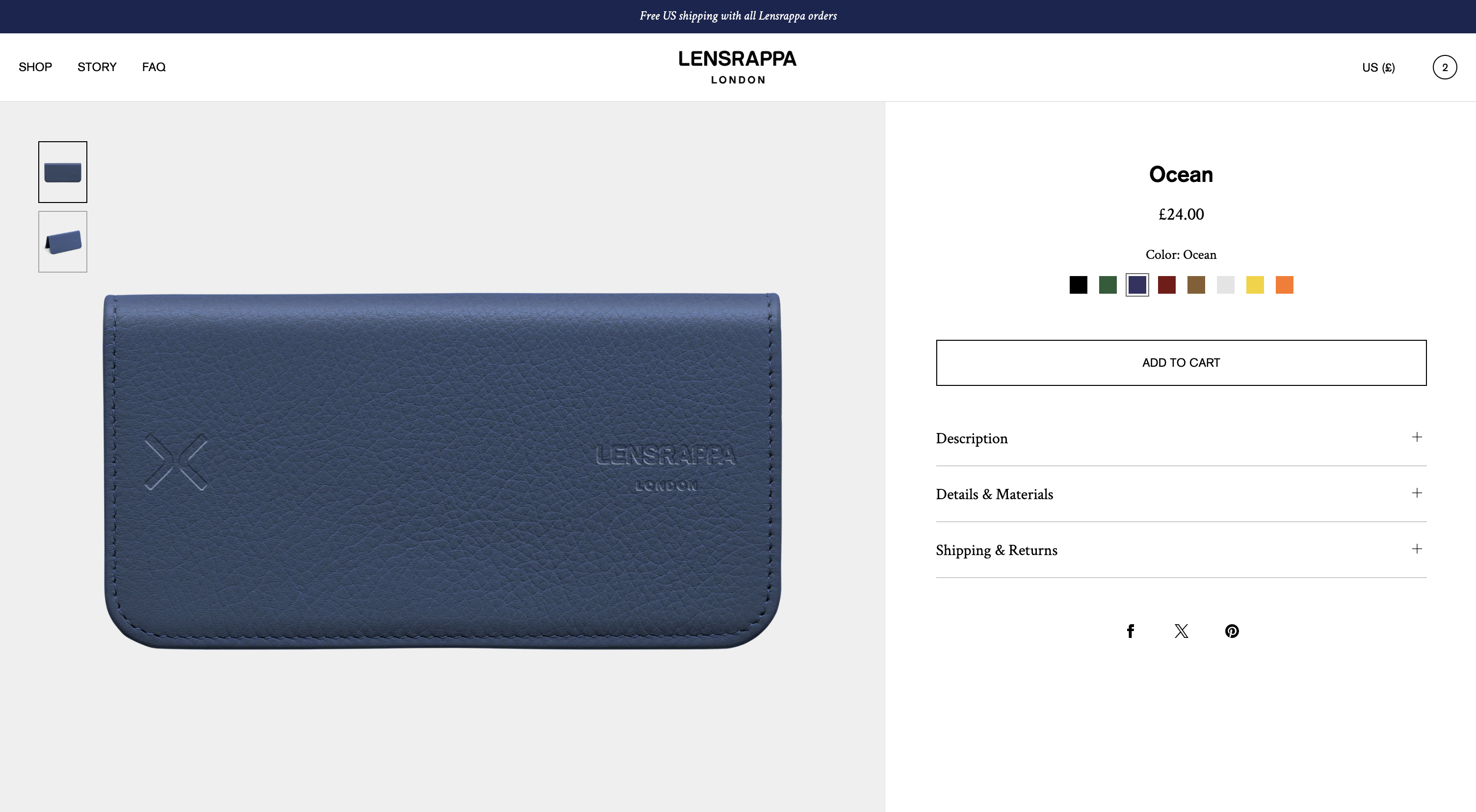
The product template includes various sections, blocks and options to enable you to craft your product pages. Luxe includes a large number of options - it is worth exploring and understanding all of the available settings.
How to edit or set up the product page
1. From the Shopify admin area, go to Online Store > Themes > Edit Theme
2. Select Products from the top dropdown and choose the template (ie Default product).
The theme comes with one product template. The template is dynamic so it will automatically display different content from each product.
Tip: Any changes or settings applied to the product template will affect every product page on your store that has the corresponding template applied. If you require a different design, features or layout for different product types, you can create separate templates by clicking “Create template”. Creating multiple templates allows you to assign different templates to different products.
Product page settings
To edit settings for the overall page style and layout, click Product information in the side bar.
Layout
Set up the image position (left, right or stacked) on desktop, and set up your preference with regards to sticky content and/or sticky buy buttons. You can enable sticky buy buttons on mobile, meaning the buy buttons will remain visible anchored to the bottom of the screen whilst scrolling.
Media
Set up things like your preferred media aspect ratio and the layout of the media gallery.
| Background color | Set a background color for media. This is useful if your product images are transparent and you want to choose a background color. |
| Media aspect ratio | Choosing a consistent aspect ratio ensures all your product images appear neat and uniform. You can choose from Portrait 4:5 (default), Portrait 4:6, Square or Landscape. |
| Set media to screen height | This setting overrides the media aspect ratio. If turned on, media will be set to the height of the screen/browser on desktop. This results in a uniform look but can result in undesired image cropping. Use carefully. Default: Off |
| Mobile carousel navigation type | Choice of: None - no navigation will display Bullets - bullet navigation will display Thumbnails - thumbnails will display |
| Bullets position | Set your preferred position of the carousel bullets, with a choice of below media or within media. |
| Desktop layout | Choice of: Stacked - all images are stacked vertically Grid - images are displayed in a two column grid Thumbnail carousel - images are displayed in a carousel |
| Number of items in view | Applies to carousel setting on desktop - offering a choice of 1 or 2 media items within the view. |
| Desktop carousel navigation type | Choice of thumbnails or arrows |
| Thumbnail position | Choice of various options such as left or right (of the media) or below media. |
| Thumbnail placement | Choice of thumbnails overlaying the image or adjacent to the image |
| Thumbnail size | Choice of normal or large |
| Desktop margin | Full width or page margin |
| Mobile margin | Full width or page margin |
| Desktop media width | Choice of widths for the media: Normal (50%), Wide (60%) or Extra Wide (70%) |
| Grid spacing | Set the spacing between images (applies to ‘Stacked’ and ‘Grid’ layouts) |
| Automatically balance grid | This setting will enlarge the first media item to balance the layout, if/when there are an odd number of media items |
| Autoplay videos | By default, any videos will autoplay and loop, with no audio. Alternatively you can turn autoplay off to enable controls and audio. |
| Play button style | Set the style of the play button on videos |
| Enable media zoom | Enables a zoom gallery (image opens in an overlay) |
| Zoom level | Choose the default zoom level for images when they open in the overlay modal |
| Zoom modal thumbnail position | Set the position of thumbnails within the mobile, with a separate setting for mobile and tablet/desktop. |
| Zoom modal color scheme | Set the foreground and background color for the modal. The foreground color will affect iconography (e.g. close button). |
Variant image grouping
Want to show multiple variant images? This can be activated by a small code edit. Please contact us for further information.
Text
Set up aspects relating to the product text and information such as text alignment, width and vertical spacing.
Product page blocks
The Product information section of the template includes a number of blocks, some of which are pre-populated in the template. Blocks can be added, removed or re-ordered depending on your requirements.
Horizontal Line
Displays a horizontal line within the page - useful for creating visual separation between other blocks. Includes option to set the width and opacity of the line.
Spacer
Inserts blank space between other blocks - useful for adding additional vertical space. Includes separate settings for mobile and desktop.
Badges
Displays any badges you have added to the product.
Product badges can be added to products by one of two methods:
Method 1: Tags (suited to single language stores only)
Add any tag in the format: “Badge: Your word”
The badge will then display on the product card. For example, if you want to add a ‘New’ badge, add a badge with the wording “Badge: New”.
Method 2: Metafields (suited to multi-language stores)
Create a custom product metafield with the namespace custom.badges
Set the metafield type to List of values, and to single line text. Ensure storefront API is turned on, and save the metafield.
Once the metafield has been created, you can add badges to any product.
Metafields can be translated into other languages using the Shopify Translate & Adapt app.
Brand
Displays the brand (vendor) of the product. Can include a link to a collection. The link will be automatically generated in the format /collections/brand-name.
Breadcrumb
Displays a breadcrumb. Requires custom product metafields.
To display a breadcrumb:
1. In Shopify admin, go to Settings > Metafields and Metaobjects, then select Products. Click “Add definition” to create a custom product metafield. Name the metafield ‘Breadcrumb’ with a namespace and key of custom.breadcrumb. Set the type to ‘Collection’, and select ‘List of collections’. Save the metafield.
2. In your product admin pages, the Breadcrumb field will now be available. You can add the collections for the breadcrumb. For example if you want the breadcrumb to be Menswear > Sweatshirts, add both of these collections in your desired order. Save your product. Repeat this process for all products.
3. Go to the theme editor and select the product template.
4. Within the ‘Product information’ section, add a ‘Breadcrumb’ block. The block includes some basic style settings to control the display.
Title
Displays the product title. Within the block you can specify the title font size (small, medium or large)
Description
Displays the product description. Within the block settings you can specify the display type:
- Accordion - the text appears in a typical open/closing tab.
- Standard text - the text appears within the page with no interaction
- Truncated text - the first 3 lines of text will display. A “Read more” link will expand to show more text.
Information tabs
Displays product information in horizontal tabs as an alternative to the typical accordion approach.
Specifications
This block is useful for separating your product descriptions into separate accordions (expanding tabs). For example, you might want to show a list of materials or technical specifications in a separate accordion to the main description.
How to set up specifications:
1. Within your product descriptions, add a word wherever you want to split the description and the specifications, such as the word ‘INFOBREAK’. Note: this heading must be written in all caps and separated from other text with a paragraph break above and below. By default, the theme uses the word ‘INFOBREAK’, but you can choose any word (the word will not actually display to customers on your store).
2. Go to the theme editor and select the product template. Click into ‘Product information’ to reveal the settings for this section. Specify your chosen word within the product settings under “Description specifications heading”. The word specified here must exactly match the word used in your product descriptions.
3. Add or turn on the specifications block within the product template.
4. Your product page should now display two separate accordions for these areas of text.
Table row
Displays a table row made up of two columns. This is useful for displaying product data such as specifications. Various options are included to set the visual aspects of the table such as margin and borders.
Line item property
Allows the inclusion of either a text or checkbox line item. This is suitable for capturing additional data with a product that is not linked to variants or pricing, such as free gift wrapping or enabling personalization of products such as jewellery. The data captured will be included in the order confirmation as a line item within the product.
Image
Displays a small inset image within the product information area. This is useful for displaying a featured image, or even connecting this field to a dynamic source to display different images for each product. The block includes options for the size of the image and the spacing above/below.
Upsell products
Displays a single or group of related products. This is designed for upselling complementary products (e.g. a cleaning product for a sofa). To display products, you must add a custom metafield to your products. To do this, follow these steps:
1. Create a new metafield with the namespace custom.upsell_products
2. Set the metafield type to list of products
3. Save the metafield
4. On any product, populate the metafield with your required products
The block includes various options for layout and iconography.
SKU
Displays the product SKU if you have added one.
Price
Displays the product price. Within the block settings you can also choose the following options:
- Show taxes
- Show discount
- Show Shop Pay
Variant picker
Displays a variant picker to allow the user to select the variant (e.g. color). You can choose from three styles of variant picker:
- Pills
- Dropdown
- Words
Depending on the type chosen, additional options allow you to control the appearance and layout.
You can also enable variant images or color swatches, allowing the variant picker to become more visual in appearance.
To use images, ensure you have added a featured image to each product variant.
To display color swatches, ensure you have set up color metafields on each product variant. You can refer to Shopify’s guide on this:
Shopify Help: Color swatches using category metafields
For images or swatches, you must input the names of your variant into the box provided in the theme settings. For example, if you want to display swatches for Color and Material, you would write in the box: Color, Material. The words written here in the theme settings must match the name of your variants in your product admin.
The block includes a number of options for the style of swatches, such as a choice of square, round or rectangle, and a size option.
Quantity selector
Displays a quantity selector. Only include this block if your products are commonly purchased in quantities of more than one. The block includes layout settings to choose from.
Feature icons
Displays a row or grid of icons, with optional labels. For best results, upload your icons in square (1:1) aspect ratio, and use a consistent size for all icon files. The block includes a number of options to set the size of icons and layout.
Pop-up
Displays a link which opens a pop-up. Useful for things such as showing a size guide or shipping details. Within the block settings you can specify the style of the link, optional icons, text alignment of the link and the page it links to. You can also specify whether it opens as a pop-up or drawer.
You can also customize the pop-up settings/style in the main theme settings.
Rating
Displays a star rating for the product, along with the number of reviews. Only works in conjunction with a compatible Shopify product reviews app.
Buy buttons
Displays the “Add to cart” button and dynamic checkout buttons (if enabled). Within the block settings you can specify the following settings:
- Style of button (solid or outline)
- Show dynamic checkout buttons (displays buttons for payment methods such as PayPal or Apple Pay)
- Show payment methods - displays small icons of the payment methods your store accepts
- Show pickup availability
- Show recipient information form for gift cards
Share
Displays a share button, which opens a device-native sharing component to allow the user to share the product on their favourite social media channels or by text, email, WhatsApp etc. On any device that does not support this type of sharing, the share buttons for popular platforms (Facebook, X, Pinterest, WhatsApp) will display directly in the page.
Text
Displays a block of text. Can be dynamically linked to product metafields, if required.
Inventory status
Displays the inventory status of the product. Includes settings to choose how inventory is displayed with a choice of status (‘Low stock’ or ‘Out of stock’) or quantity (the number in stock). You can set a threshold for low stock via a range control.
Note: This block only works if your products use Shopify inventory management.
Custom code
Allows you to insert custom html or liquid code into the product page. This block is intended for developers only - use use this block only if you have sufficient expertise in writing custom liquid code.
Collapsible row
Inserts an opening/closing row of content into the page, with your choice of heading and text. For each collapsible row, you must add a heading and row content.
Your row content can either be static or dynamic:
Static: Write your text within the text box provided - this text will remain the same on every product using this template.
Dynamic: Click the ‘stack’ icon (top right of the text box) and click “Connect dynamic source” - you can then link this text box to display content such as metafields. This means the content will be different for each product using this template. For example you could create a product metafield for product specifications, and link it dynamically here.
Row content from page: You can connect any page from your store.
Sibling products selector
Allows you to include images or swatches linking between different products (for example different colors of the same product). This acts very similar to a normal variant picker, but actually links between different products.
Requires the use of product metafields and metaobjects. To use this feature follow the steps below. You can also refer to the Shopify Metaobject Guidelines.
Stage 1: Set up the Cross Links metafield
1. Create a product metafield definition with the name ‘Cross links’ and namespace custom.cross_links and set the type to product, list of entries (not single). Ensure that storefront access is switched on. Save the metafield.
Stage 2: Add the links
Once your metafields are set up, you can add the cross links.
1. In Shopify admin, open the product you wish to add cross links to.
2. Scroll down to the Metafields section of the page.
3. Click on Cross links and select the product/s you want to link to.
4. Click save.
5. Follow steps 1-4 for other products you wish to link to each other.
6. In the theme editor, ensure you have the Cross Links block added in the product template. To check the appearance of the cross links on your product page, preview the product or view it within your store.
Stage 3: Optional - if using color swatches, it requires creating a metaobject for your colors and then an additional product metafield.
1. In Shopify admin, go to Content > Metaobjects.
2. Create a new metaobject, add your colors as entries with two fields as follows:
a) ‘Name’ with key color.name and type ‘Single line text’. Must be one value, not list of values. Set to required.
b) ‘Swatch’ with key color.swatch and type ‘Color’. Must be one value, not list of values. Set to required.
c) Optional: If you require swatches to display using an image (such as to include a texture or pattern), it is also possible to add an image field to the metaobject. Use the key color.swatch_image and type ‘File’.
3. In your product metafields, you can now create a product metafield for color with the namespace custom.color and set the type to metaobject, list of entries (not single). Select your ‘Color’ metaobject from the dropdown list of available metaobjects.
4. Save the metafield.
5. On each product, you can now specify the color/s of the product in this new metafield.
6. In the theme editor, go to the product template, and click into the Cross Links block. You can now set the style of the swatches to be a color swatch rather than a thumbnail image. You can also choose from three styles for the color swatches (square, rectangle or circular).
Optional: Use custom images. Use a product metafield with namespace custom.cross_link_thumbnail, with the type set to file.
Note: Color swatch meta data is an advanced Shopify feature. If you require assistance with setting up metadata or metaobjects, please contact our support team. A charge may apply.
Collection links
This section is hidden by default - to activate it click the eye icon. This section displays links or buttons to related collections. The collections are populated automatically based on your product collections.
Complementary products
This section is hidden by default - to activate it click the eye icon. For this section to work, you must have the Shopify Search & Discovery app installed and activated.
Related products
This section is shown by default. Recommended products are shown automatically based on an algorithm. For this section to work, you must have the Shopify Search & Discovery app installed and activated.
You can customize various settings in this section such as choosing the number of columns and enabling or disabling ‘Quick add’.
Recently viewed products
This section can be added to the product template. The recommended position is towards the bottom of the page, below other content. The Recently Viewed section will display up to 6 recently viewed products. Products are represented by the featured image and product title. Brand name can be activated if required. Prices are not displayed.
Pre-order products
Luxe has a number of built-in features to support pre-order products.
Button wording
To change the “Add to cart” button wording to say “Pre-order” you can take the following steps:
1. Create a separate product template containing the word “preorder” or “pre-order”.
2. After, in your product admin pages, assign this template to your pre-order products.
Alternatively, add a tag “preorder” or “pre-order” to your pre-order products. This will also change the button wording for those products.
Note that the above theme features will not affect the full user journey when purchasing a pre-order product (such as cart or email order confirmations). These parts of the user journey are not covered within the theme – they require additional development work.
Pre-order apps
Shopify also has specific pre-order apps available. For more information visit shopify.com/pre-orders