Featured collection
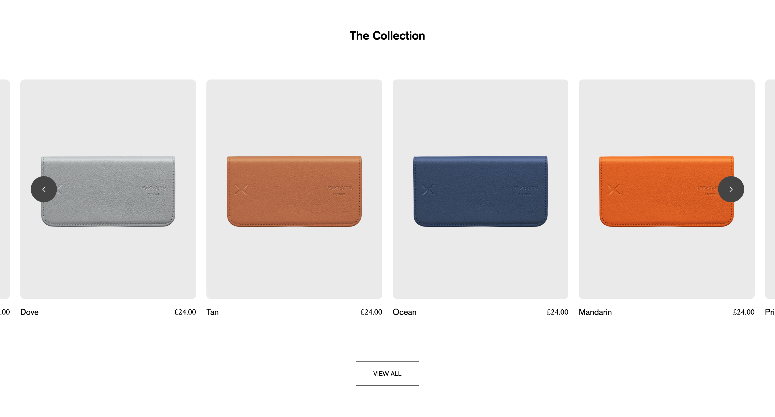
Displays a selection of products from a chosen collection.
| Collection | Choose the collection you wish to display products from. |
| Alignment | Set the alignment of the section heading and sub heading. |
| Caption | An optional caption for the section |
| Heading | The heading of the section, e.g. ‘New Arrivals’ |
| Heading size | Choose from Normal, Large or XL |
| Description | An optional description |
| Show ‘View all’ button | If switched on, displays a button linking to the collection page |
| Button label | Sets the label on the ‘View all’ button |
| Button style | Choose the button style (Outline, Solid or Text) |
Product cards
| Layout | Choose from a grid or carousel layout |
| Arrow style | Choose the arrow style for the carousel |
| Margin | Choose whether to include a left/right margin |
| Maximum products to show | Choose how many products to display |
| No. of columns | Choose the number of columns on mobile, tablet and desktop (each has a separate setting for maximum control) |
| Additional image browsing | Choose from: 2nd image on hover Multi-image carousel (displays up to 4 images in a carousel) |
| Show prices | Set whether prices are displayed |
| Show brand | Choose whether to show the vendor (brand name) for each product. Tip: If your store only sells one brand, always uncheck this. |
| Enable ‘Quick add’ | If selected, each product will include a button to allow the customer to add it directly to cart, or if a product has multiple variants the button will link to the product page. |
| Show product title on hover | If switched on, product titles will be hidden on desktop, and display on mouse hover. |